Accessible AI Infographics
For the European Disability Forum (EDF)
The Client
The European Disability Forum (EDF) is an independent NGO that defends the interests of 100 million persons with disabilities in Europe. As a strong voice in EU policy, EDF advocates for accessibility, equality, and the rights of persons with disabilities. In the context of the EU AI Act and broader digital inclusion goals, EDF commissioned a series of infographics to explain how AI impacts persons with disabilities — and what’s needed to ensure it serves everyone.
The Brief
Design two infographics — one for persons with disabilities and one for policymakers and developers — that are visually engaging, easy to understand, and above all: accessible. The goal was to communicate key messages from EDF’s policy work in a way that resonates with multiple audiences and works across formats (print, digital, and social media).
EDF asked for:
A clear and human visual language
Representation of disability in diverse, respectful ways
Layouts that meet accessibility standards
Flexible visual assets to reuse for social media posts
The Approach

Beginning with early sketches exploring possible illustration styles and layout options, the design process evolved through several feedback loops to shape the final infographics. Accessibility was a guiding principle from the outset — influencing not only visual decisions but also content structure, contrast, and hierarchy. The result is a visual system that combines approachability, clarity, and inclusivity, while maintaining a professional and focused tone.
The Solution
Two infographics, each consisting of two pages:
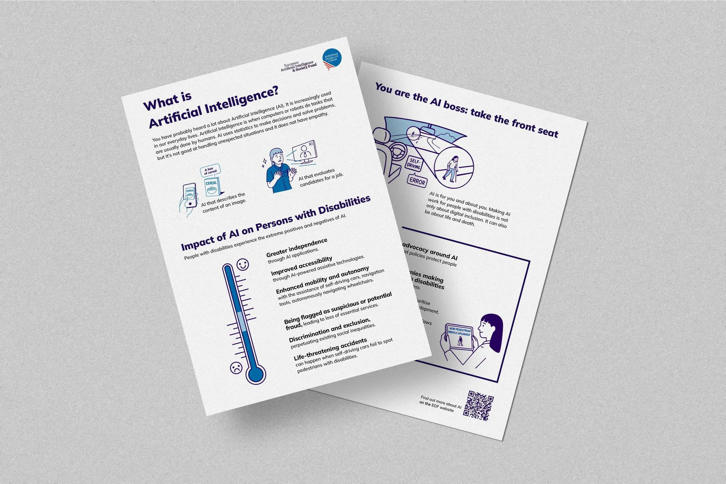
Infographic 1: For Persons with Disabilities
Introduces the concept of AI, illustrates its impact on daily life, and highlights both opportunities and risks. A vertical impact barometer visualises a spectrum from highly beneficial to potentially harmful outcomes, concluding with actionable steps for greater inclusivity in AI.
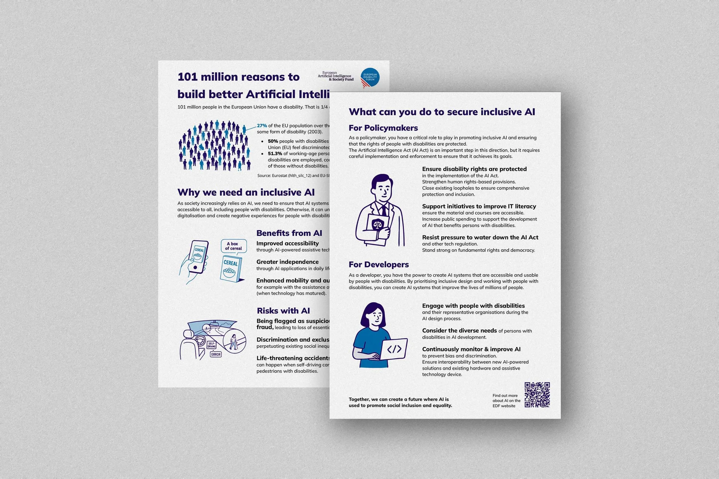
Infographic 2: For Policymakers and Developers
Promotes inclusive AI development by drawing attention to risks of discrimination, interoperability challenges, and the need to involve persons with disabilities in the design process.
Variations for Social Media
